The Phantom in Colour — a Personal Preference
From a Norwegian boy’s disappointment in 1971 to colouring classic stories for Frew: why I have always wanted more colour in the Phantom’s world.
I have always wanted colour
I have always preferred colour in my comics and illustrations. It is as simple as that. I can admire a beautifully drawn black-and-white page, and I have read and enjoyed a great many of them. Even so, given a choice between that page and a well-coloured version, I know which one I would choose.
I find it difficult to understand the opposite preference. Some readers say that colour obscures the linework. Others point out that a particular strip was created for black-and-white publication and should remain that way. I understand the arguments, but they have never changed what I enjoy seeing.
Of course, the quality of the colouring matters. A dark or badly chosen colour can make fine lines difficult to see. Thoughtful colouring can help distinguish figures, give a setting depth and make the action easier to follow. For me, it adds something to the drawing, and to the pleasure of reading it.
This is a personal preference, formed over many years. With the Phantom, those years included a very long wait.
1971: the year the Phantom did not arrive in colour
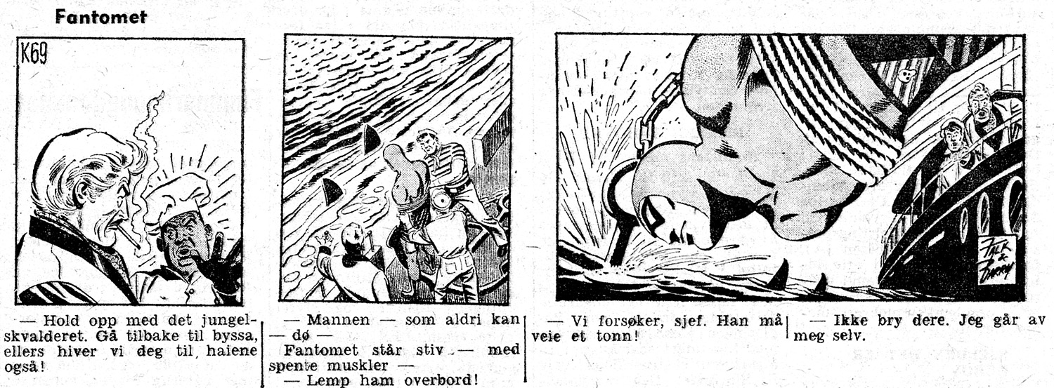
The regular Norwegian Fantomet magazine began in 1964. It grew out of the Swedish Fantomen, and the stories reached Norway already edited for the Swedish comic-book format. Although Fantomen had begun with colour interiors in 1950, it had switched to black and white in 1955. By the time the Norwegian magazine appeared, that was the format it inherited.
The covers could be wonderfully colourful. Inside, however, the adventures were in black and white. That became the familiar Norwegian Phantom, and it remained familiar for decades.
In 1971, I thought things might finally change. I remember other Norwegian comic magazines gaining colour around that time, and I hoped Fantomet would follow. It did not. For a boy who loved colour, this was a considerable disappointment.
I sometimes describe it this way: 1971 was the year the Phantom did not arrive in colour.
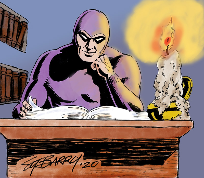
There were welcome exceptions outside the regular magazine. The colour albums that appeared in the 1970s gave me something I had wanted for years: Sy Barry’s Phantom in colour. The 1973 annual, with S062 — Old Baldy, was one such pleasure. These albums made the continued absence of colour in the ordinary magazine all the more noticeable.
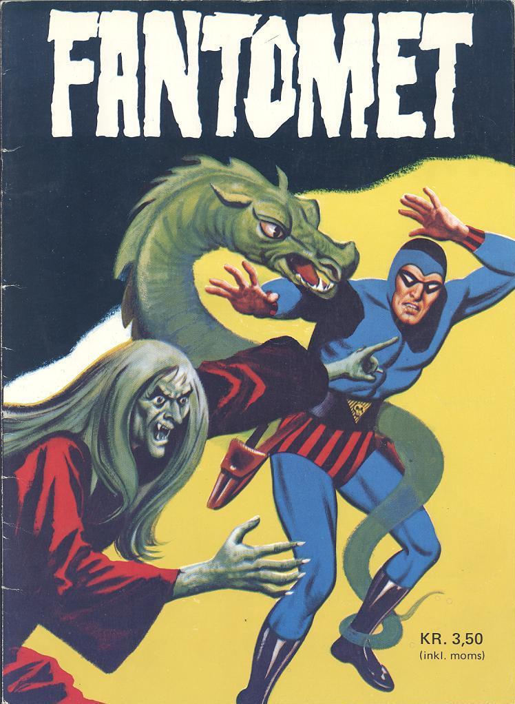
The regular magazine finally changed to colour in 1991. I had waited long enough to welcome it wholeheartedly.
When colour became a problem
What surprised me was that some Norwegian fans did not welcome the change at all. As I remember it, some even stopped buying the magazine because they wanted their Phantom in black and white. To a reader who had spent years hoping for colour, that was rather frustrating.
Looking back, I can understand something of their reaction. They had grown up with a particular appearance. The stories had been prepared for that format, and strong black lines, shadows and white spaces were part of the experience they loved. Colour changed the look of a familiar magazine. Readers with no strong preference probably thought much less about it.
It has sometimes been claimed that colour caused the magazine’s circulation to fall. I am not convinced. A fall in sales after a change does not, by itself, explain why readers left. My own suspicion is that other circumstances mattered more. I would be reluctant to give colour the blame without a much clearer account of what was happening.
What I can describe is my own response: I was pleased that the colour had finally arrived.
The same Phantom, different traditions
I later discovered how much my Norwegian reading had shaped my idea of the series. Elsewhere, readers had long been accustomed to a Phantom in colour.
In the United States, the comic-book series passed through Gold Key, King and Charlton between 1962 and 1977. That familiar run comprised 73 issues, ending at number 74 because number 29 was skipped. Its colour interiors offered a very different experience from the Norwegian magazine I knew.
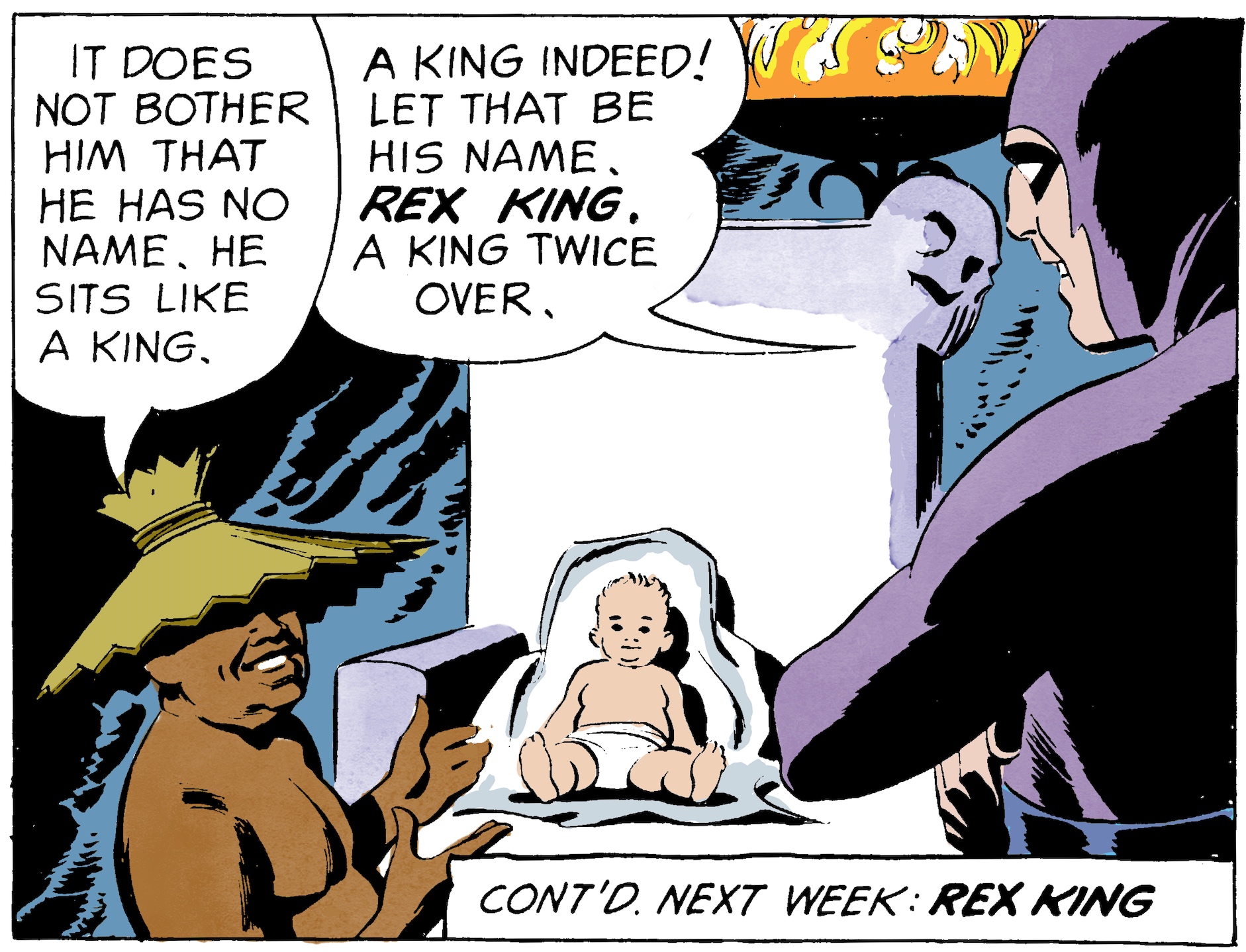
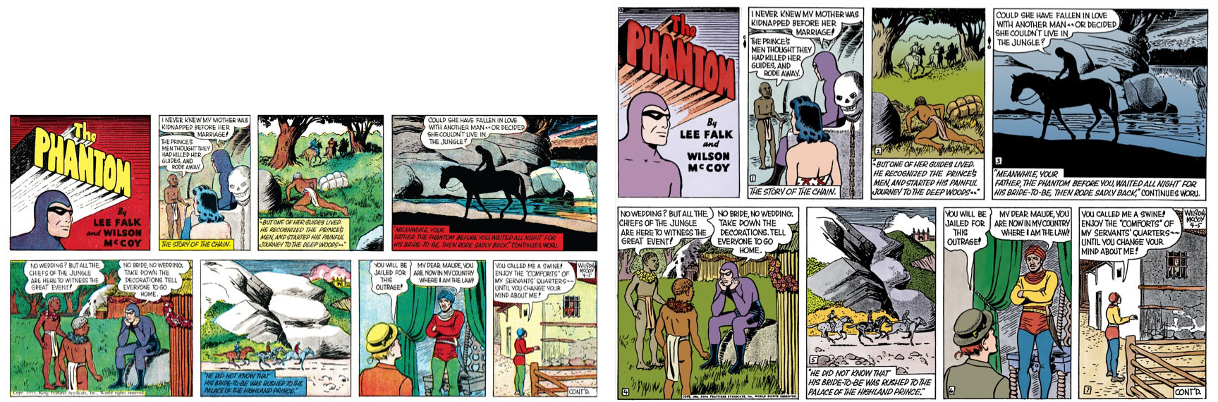
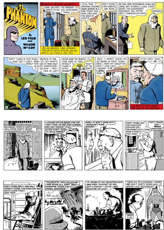
The American Sunday strip had its own colour tradition, beginning in 1939. This is an important distinction when someone says that the Phantom was made for black and white. That is a reasonable description of the traditional daily strip, but it cannot describe the whole newspaper series. Sunday adventures that Norwegian readers encountered in black and white had originally been presented in colour.
India offered another approach. Indrajal Comics, published by the Times of India group from 1964 to 1990, became a major home for the Phantom. The Indian editions I have seen often used colours that were rather bright, sometimes positively garish, to my taste. I wanted colour, but I did not necessarily want every colour decision those editions made.
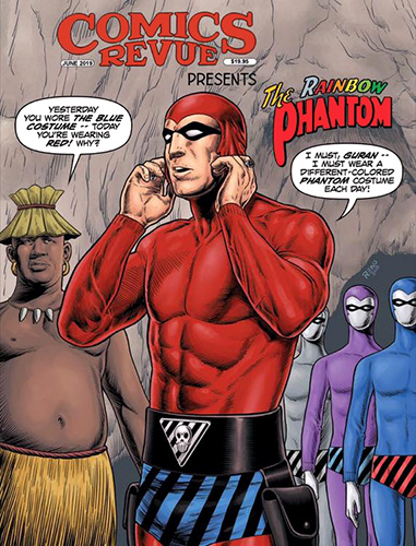
These differences also extended to the costume. The familiar Scandinavian Phantom was blue; the American original was purple. For a reader brought up with one version, the other could initially look wrong. What we call the natural appearance of a character often owes quite a lot to the editions we first read.
Australia: a gradual change at Frew
Australia had a tradition much closer to Norway’s. Frew began publishing The Phantom on 9 September 1948, and black-and-white storytelling became a lasting part of the magazine’s identity.
There is a small distinction worth making here. Frew used colour inside its 1998 anniversary edition, but not for the stories. The later move towards colour adventures was therefore a different step.
New owners took over at the beginning of 2016, with Dudley Hogarth continuing as editor. That year, issue 1748 paid tribute to Paul Ryan by presenting Terror’s Mutiny in full colour, with a black-and-white cover. It was an adventurous reversal of the familiar arrangement.
Frew then explored colour through occasional issues and material in its annuals. The publisher’s own comments in 2017 described both the enthusiastic reception of the Ryan tribute and subsequent resistance from some readers. After so many decades of black and white, a gradual approach seems quite understandable to me.
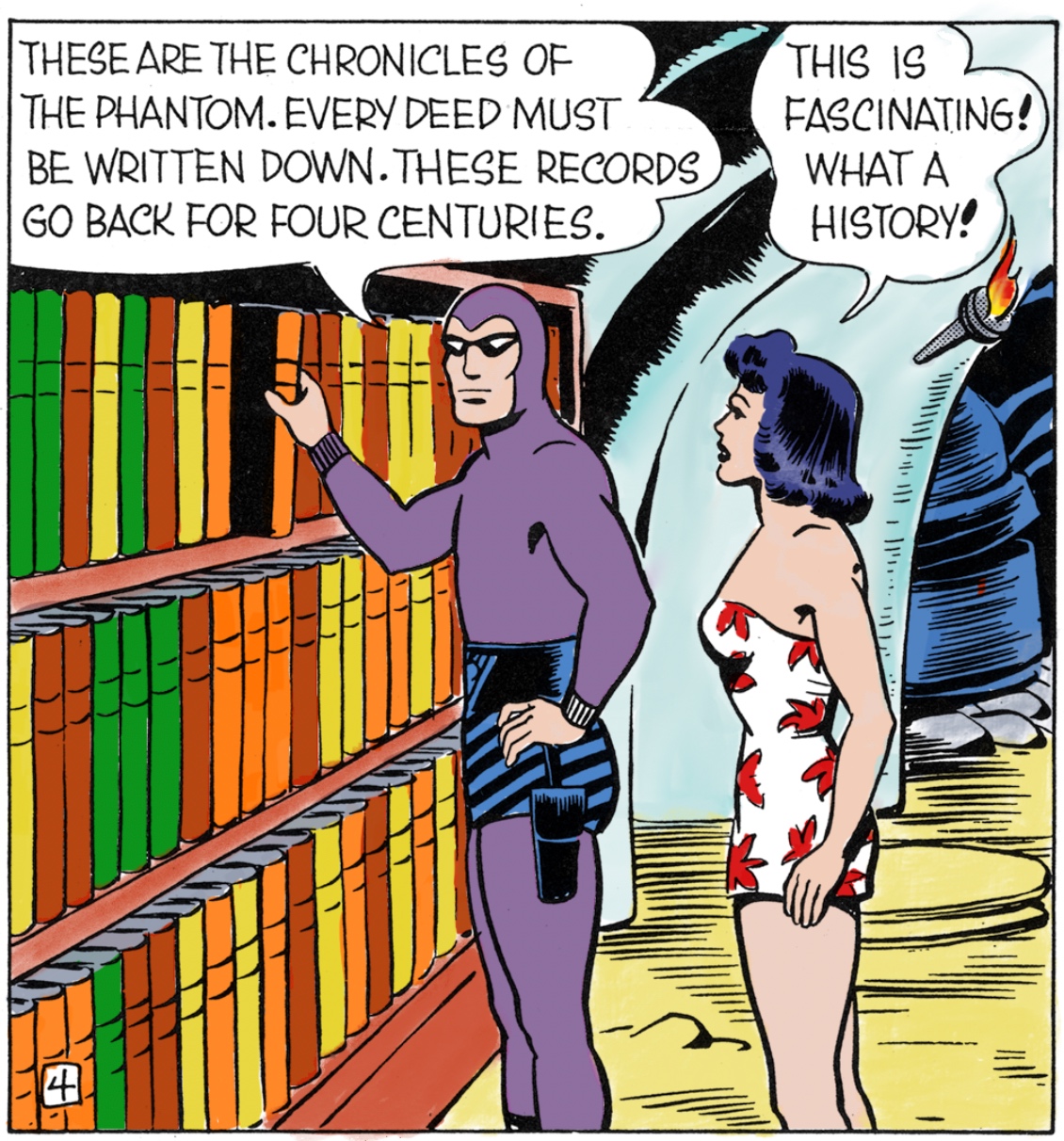
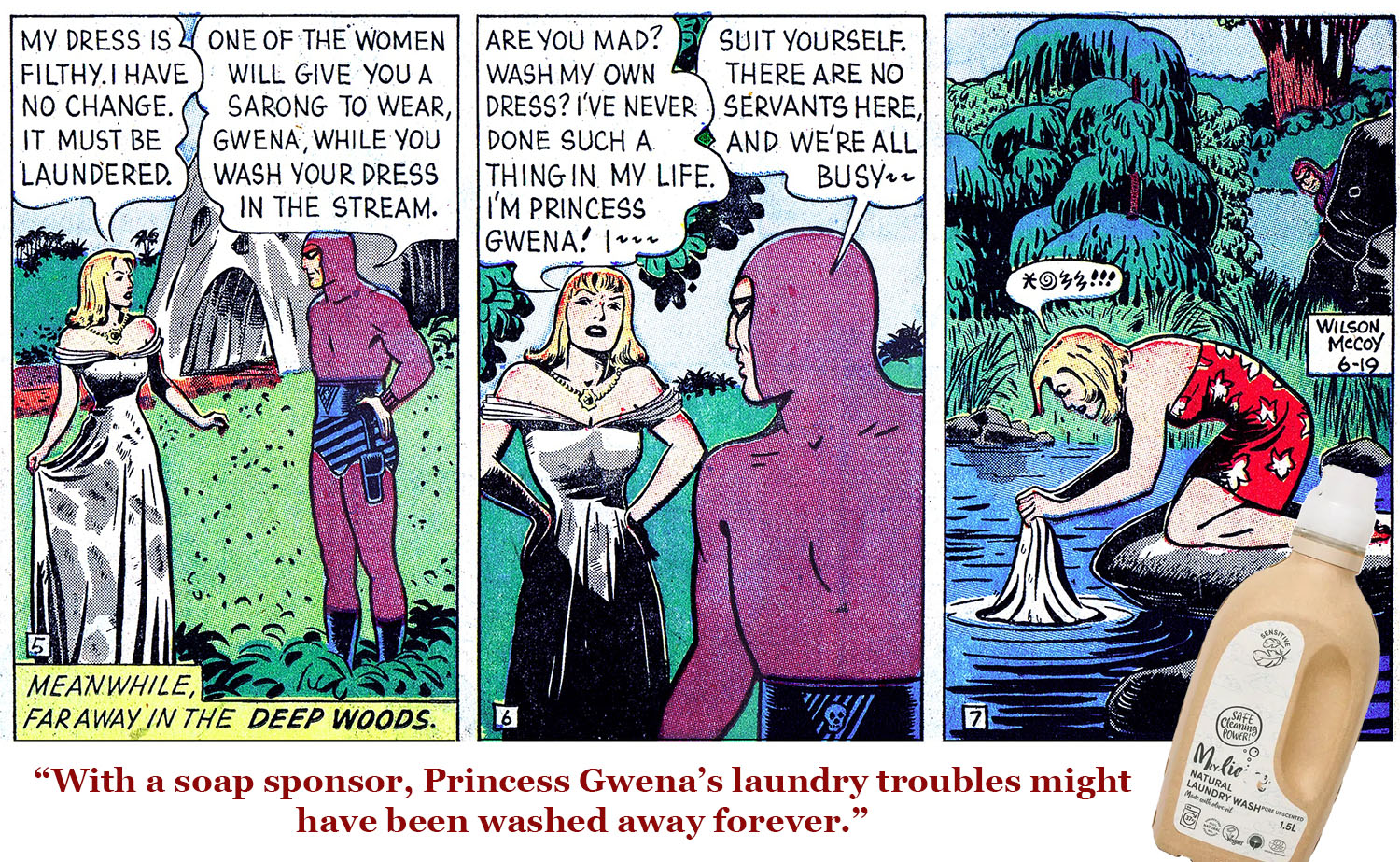
I also had the pleasure of contributing. My first colouring assignment for Frew was for the 2017 Annual, working on Falk and Wilson McCoy’s S032 — The Female Phantom. I followed the old Sunday colours closely, preparing the artwork for a fresh printing. More work followed.
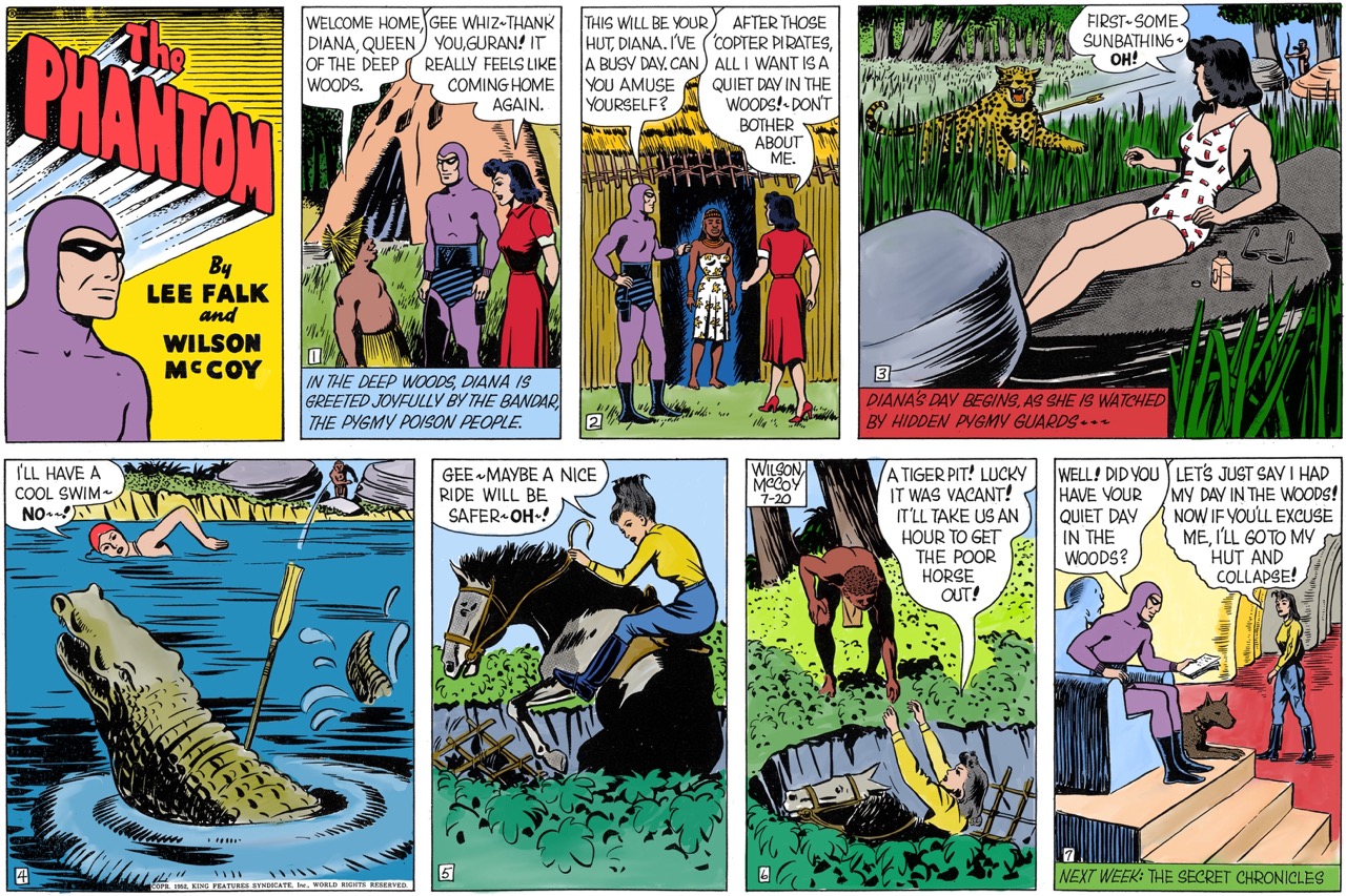
I have described that work in more detail in Bringing the classic Phantom back to print. It gave me the opportunity to do something practical about a preference I had held since childhood.
And what about the daily strips?
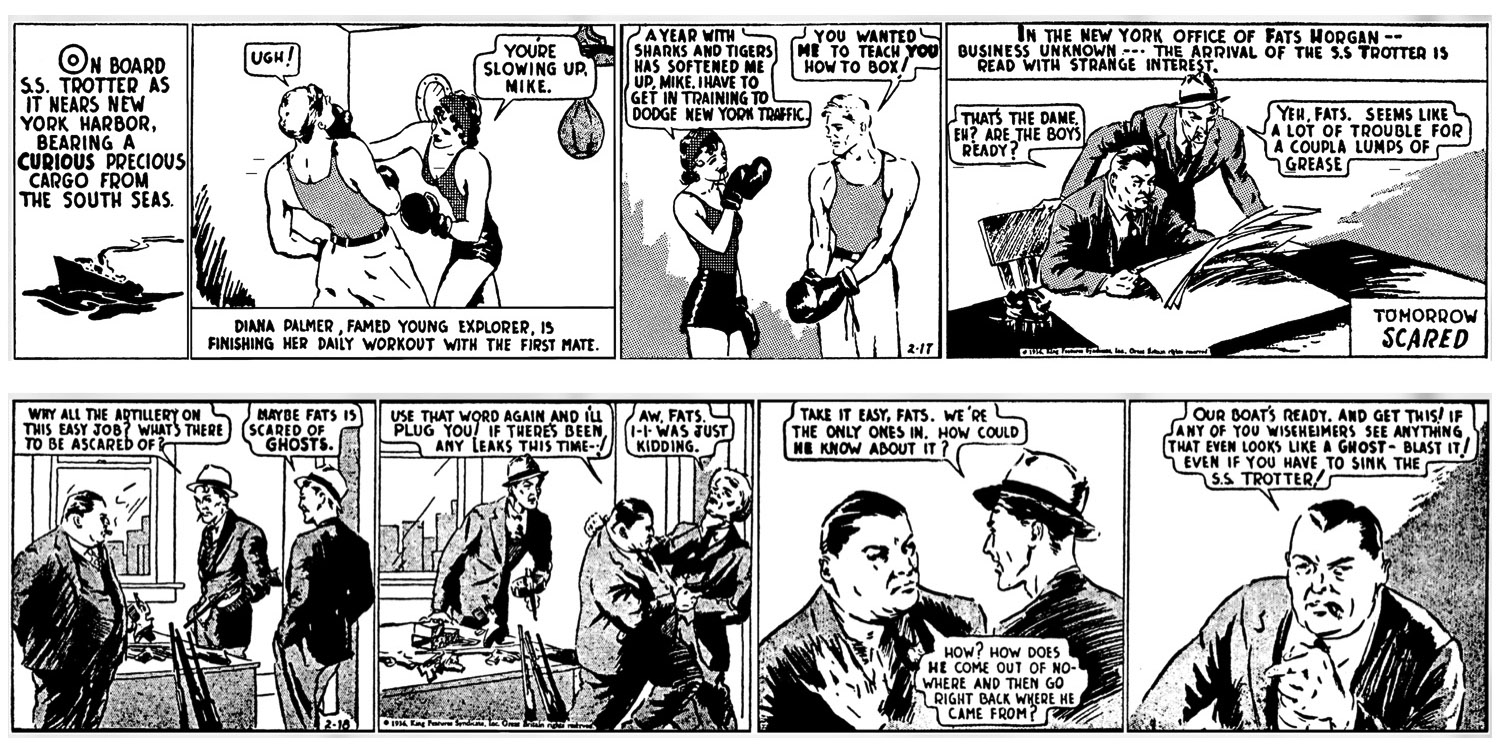
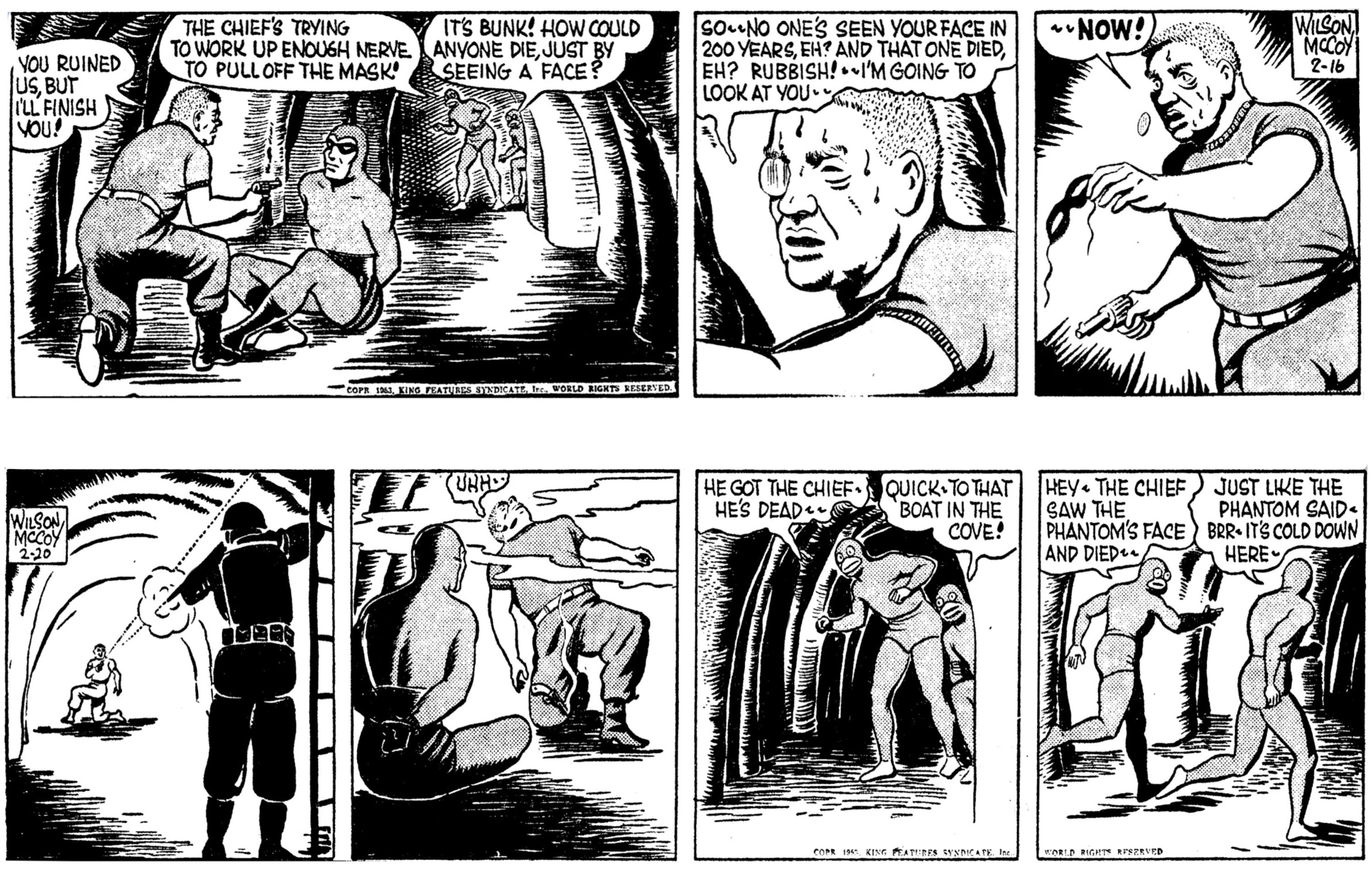
The daily strips were traditionally drawn and printed in black and white. Their artists had to make the panels work through the lines and solid blacks alone, and I readily accept that the original presentation has a value of its own.
Colour versions of the dailies have also become familiar in more recent publication. I associate this gradual change with the period around the late 1990s, though I would not put a single starting date on it without checking the particular newspaper or edition. A daily strip appearing in colour in one place does not mean every publisher changed at the same time.
For me, the attraction remains the same. I can enjoy the original black-and-white strip and still prefer a good colour version. Preserving the original and offering a coloured edition can both serve readers who love the artwork.
A preference I have put to work
My preference has survived all these years. It also lies behind my own efforts to bring colour to Phantom material for Australian and Norwegian readers.
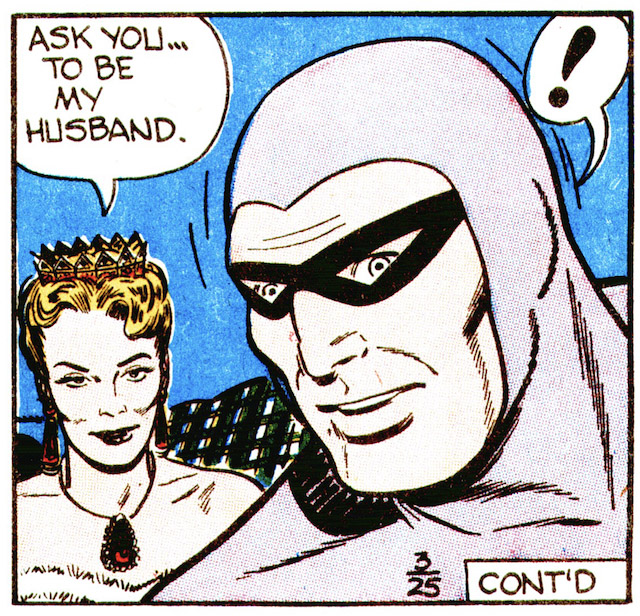
Working with the pages has made me more aware of what good colouring demands. The linework must remain clear. Shadows need room to do their work. The palette should suit the scene, and when I restore a Sunday page, its original colours matter to me.
I still cannot quite share the enthusiasm of readers who would rather have no colour at all. We can enjoy the same stories and admire the same artists while wanting different things from the printed page.
For me, colour has always made the Phantom’s world a little more inviting. The boy who waited in vain in 1971 would be pleased to know that, many years later, he would help put some of it there himself.