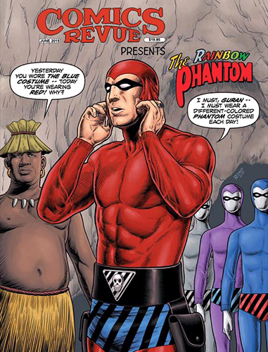
The Phantom’s Costume: Why So Many Colours?
For many readers, the colour of the Phantom’s costume seems beyond discussion. Of course it is purple. Or blue. Or red. The answer depends largely on where you grew up and which newspapers or comic books you read.
That is what makes the subject interesting. The Phantom is recognisable across the world, yet one of the most obvious features of his appearance has never been quite universal. Different publishers gave him different colours, and those choices gradually became traditions of their own.
Before there was a colour
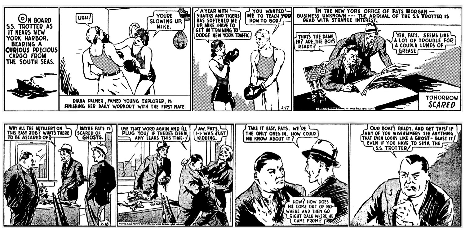
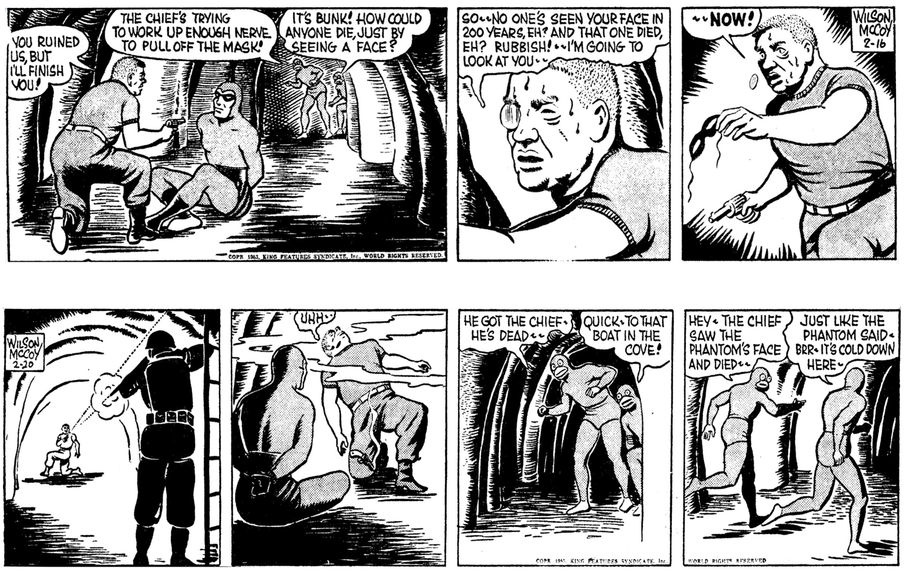
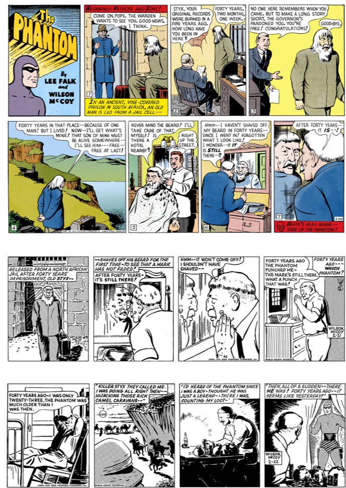
When the Phantom first appeared in American newspapers on 17 February 1936, the daily strips were printed in black and white. Readers could see the close-fitting costume, mask, striped trunks and skull belt, but the printed artwork could not give them a definite colour scheme.
There are clues, nevertheless. Early dialogue refers to grey, and the expression “Gray Ghost” has become part of the discussion about Lee Falk’s original intention. The idea of a grey Phantom is therefore more than a modern collector’s guess. But it is still worth being careful about treating one explanation as the whole story: Falk’s later recollections also included green and brown, colours that would have served a rather different purpose from the purple we know today.
A subdued grey, green or brown would make sense for a mysterious figure moving through the jungle. Purple is less convincing as camouflage, but very effective as the identifying colour of a comic-strip hero. Whatever Falk first imagined, the published colour became something that readers, printers and editors helped establish.
There is a familiar story that Falk was away when the colour was chosen and returned to find his intended “Gray Ghost” dressed in purple. It is an appealing account, and may contain the truth, although the precise circumstances remain uncertain. What is clearer is that Falk later described a failure to pass on his colour instructions. The colourists made a choice, and that choice outlived the uncertainty surrounding it.
Purple—and several versions of purple
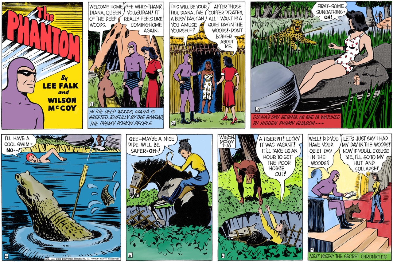
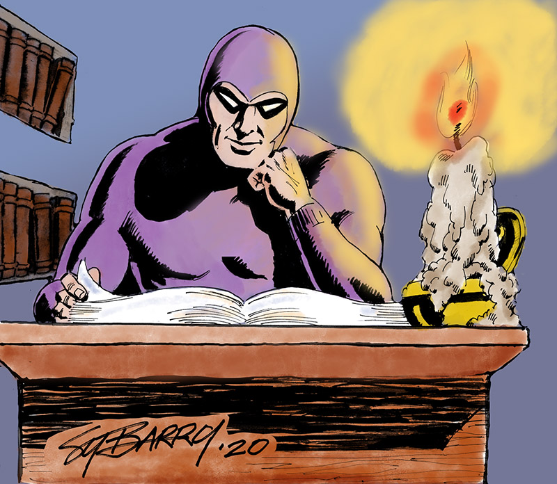
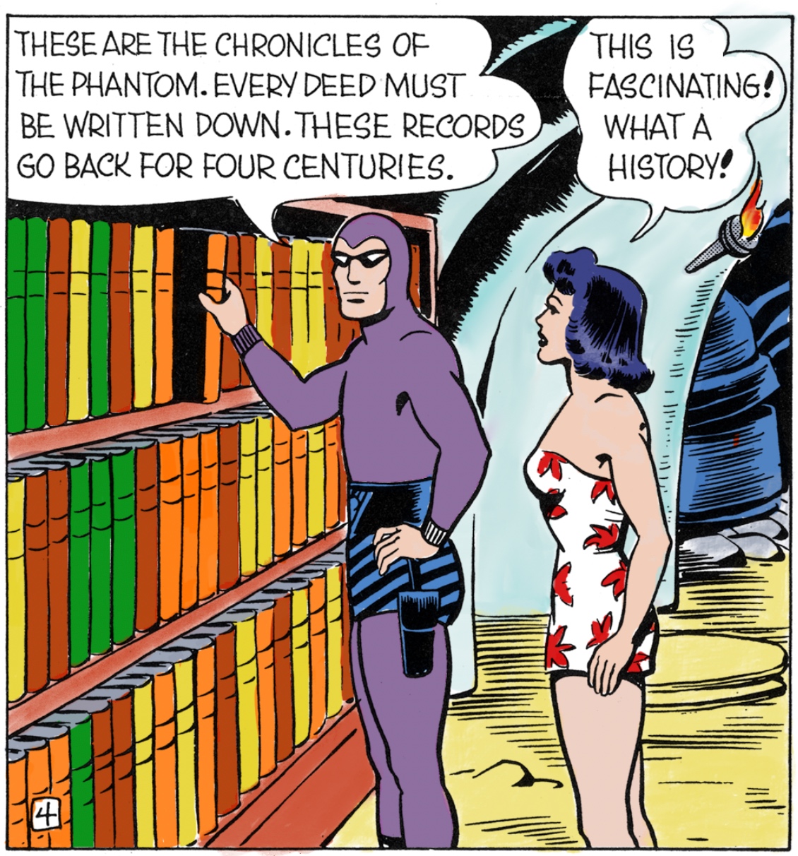
The American Sunday strip began on 28 May 1939. With the arrival of the colour Sundays, the Phantom acquired the purple costume that became standard in the United States and familiar in Australia as well.
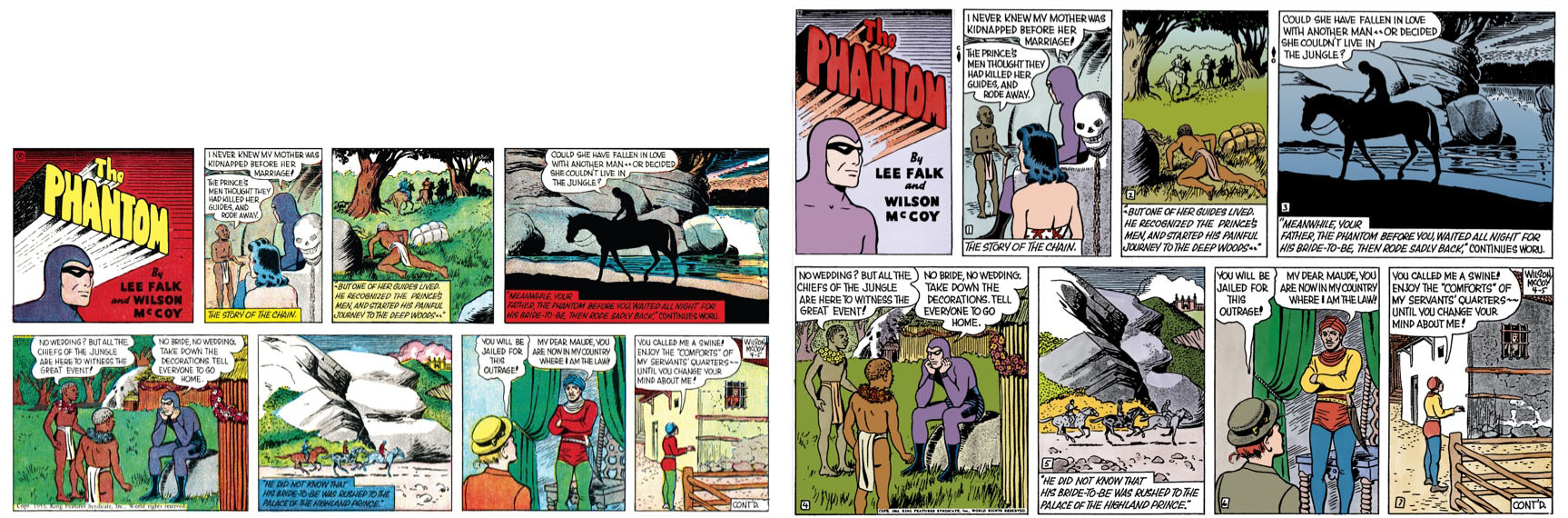
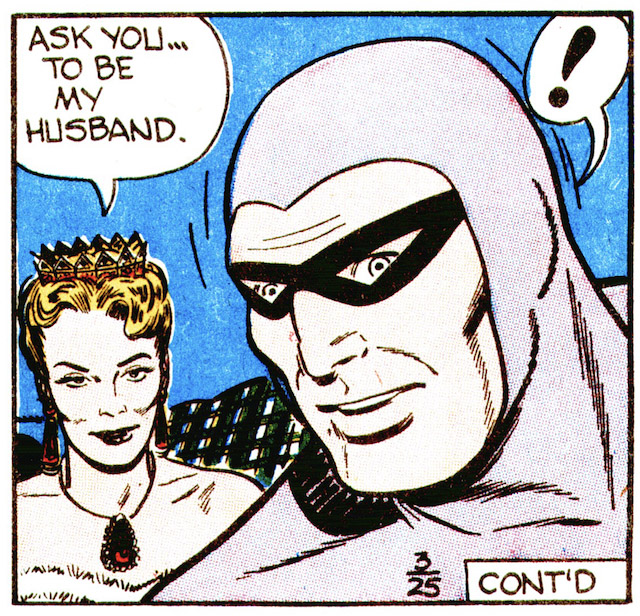
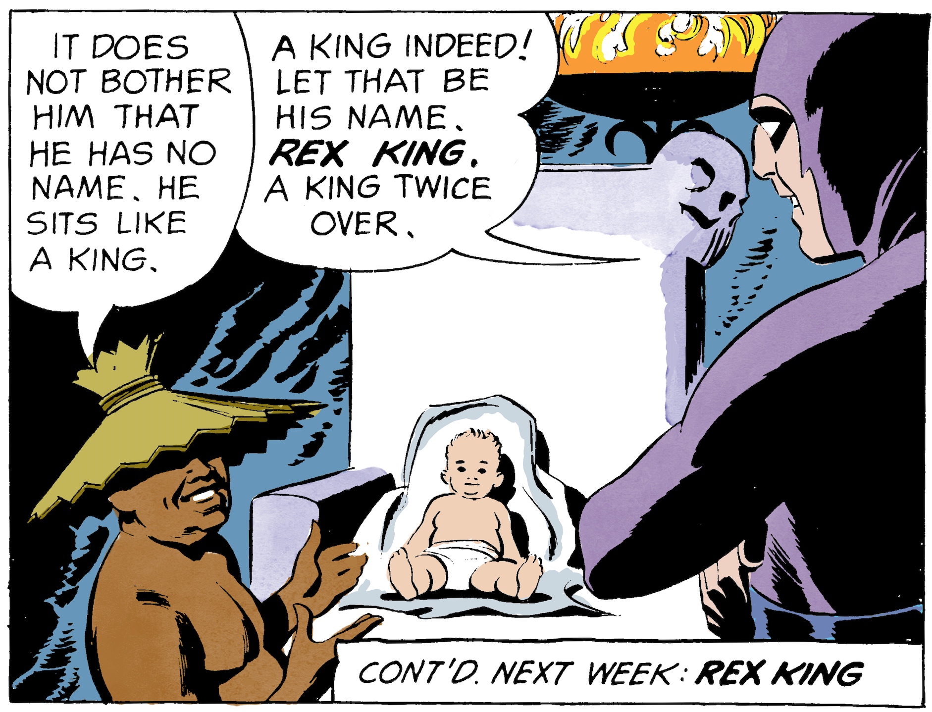
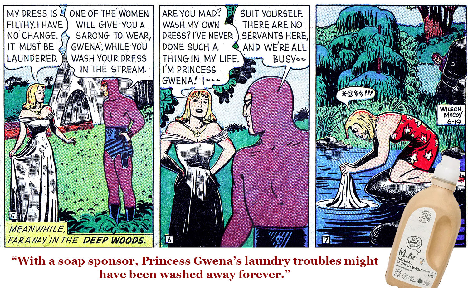
Yet even the American purple is not always the same purple. In examples I have seen, it can be strongly reddish, a deep violet, or so pale and bluish that it almost seems to belong to another colour tradition. Put Sunday pages from different newspapers beside one another and the differences can be striking.
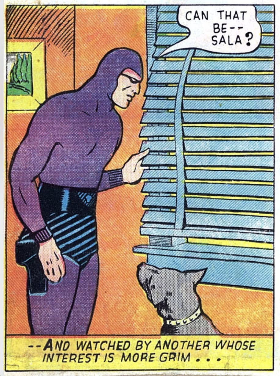
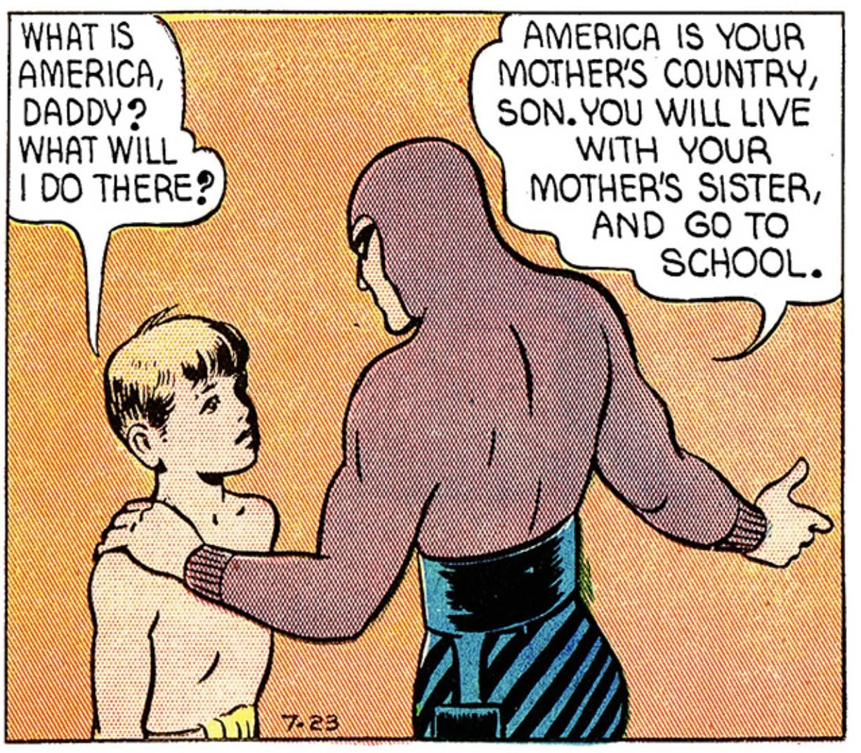
Despite all this, we still call the American costume purple. The term describes an established tradition rather than one perfectly consistent shade.
Italy’s red Phantom
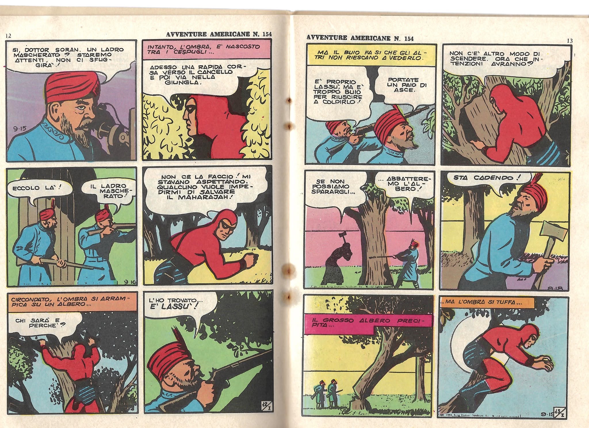
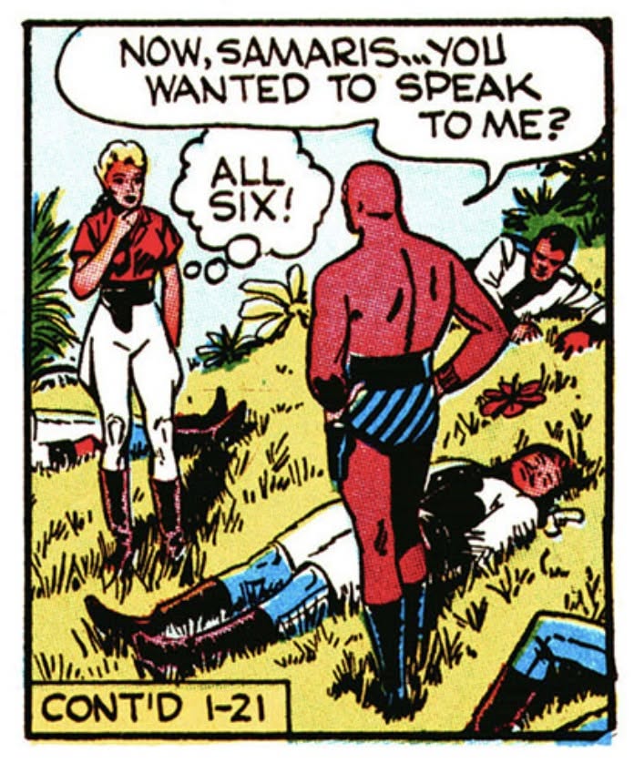
Italy offers a particularly interesting explanation for an entirely different colour. The Phantom reached Italian readers through Nerbini’s publications in the 1930s, before the American Sunday strip supplied a regular colour version to follow. The daily strips arrived in black and white, and local publishers had to make their own decisions when presenting them in colour.
Their Phantom became red.
The timing explains why they did not simply copy the purple Sunday costume. It does not, by itself, explain why they chose red rather than blue, green or grey.
One theory is that an Italian editor had seen an American book cover on which the Phantom appeared in a reddish or brownish costume. That cover may have served as a guide, with the printed costume becoming a stronger red in the Italian version. Perhaps the editor chose the clearest and simplest colour available. The book-cover explanation remains an unconfirmed story, but it is worth keeping in mind when looking at early editions.
My own thought is that red may also have been a practical choice. A brownish figure could look rather dull on inexpensive paper, while a strong red would separate the Phantom clearly from the scenery around him. In a small panel, where the reader needs to recognise the hero immediately, that difference matters.
It is also possible that other publishers followed an existing red version rather than inventing their colour scheme independently. Red became familiar in French editions and elsewhere, although the connection between individual publishers would need to be traced before we could say who followed whom.
Scandinavia: from purple to blue
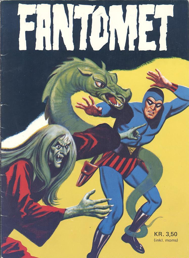
The Scandinavian Phantom is usually blue, with red trunks crossed by black diagonal stripes. For readers who grew up with that version, a purple Phantom can look just as unusual as a blue one does to an American reader.
There is an often-repeated explanation that Scandinavian printers could not print purple. I find that too simple.
The Phantom appeared in Norway through the Sunday strips in A-magasinet in November 1939. The early Norwegian examples I have seen use the original purple costume. Purple was therefore possible. The question is why blue later became the preferred choice.
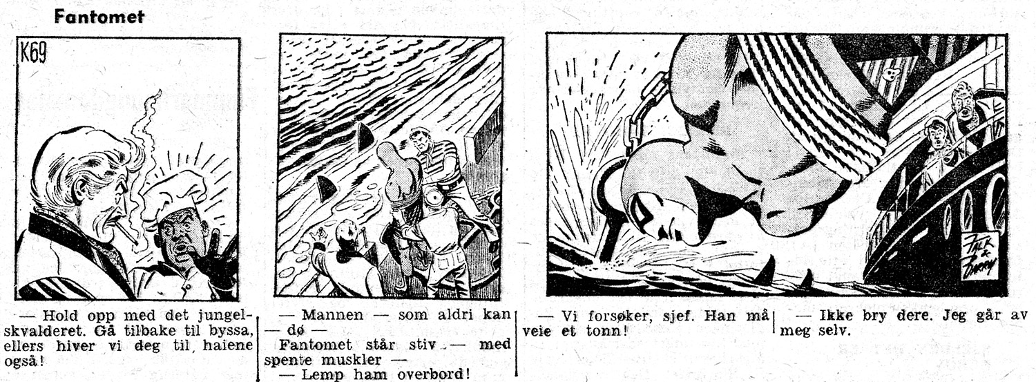
The change was established early in the Scandinavian comic-book tradition: the Swedish Fantomen magazine used a blue costume in 1950. Newspaper strips, magazine covers and interior pages did not necessarily change together, however. A colour could be familiar on a cover while readers still encountered the adventures themselves in black and white.
I suspect that the old printing explanation contains some truth, but needs to be expressed more precisely. Being able to print a colour is one thing; reproducing it clearly and consistently on cheap paper is another.
Purple is commonly produced by combining cyan and magenta. Blue can also be a mixed colour, depending on the shade, so the explanation cannot simply be that one required colour mixing and the other did not. Ink balance, screening and paper quality could nevertheless make a particular purple less satisfactory than the blue a publisher chose instead.
In process printing, colours are built from patterns of small dots. On absorbent or rough paper, those dots can spread and lose definition. A muted purple costume beside pale greyish-blue trunks might then look muddy, especially in a small panel filled with fine lines. A stronger blue could give the figure a more distinct appearance.
The red trunks provide another useful contrast. Their black diagonal stripes remain part of the Phantom’s familiar design, while the red areas distinguish them from both the costume and the black printing. An explanation linking this treatment to improved clarity has appeared in accounts of the Scandinavian colouring tradition. I would still hesitate to turn it into a single explanation for every edition, but it fits the practical problem rather well.
This is my theory about the broader development: blue and red worked well together under the conditions in which the comics were produced, and repetition made that combination the Scandinavian Phantom’s natural appearance.
Other colours, other traditions
Green and brown versions add further variety to the picture. Without knowing the history of each edition, I cannot say why every publisher made its particular choice. A colour might have come from a reference image, an earlier local publication, a printer’s preference or an editor’s own idea of how a jungle adventurer ought to look.
Once readers had accepted a version, there was less reason to replace it. A publisher switching from red or blue to American purple might have been following the original Sunday tradition, but would also have been changing something familiar to its own readers.
Today, modern colouring gives us much more control over contrast, atmosphere and consistency. Comparing a modern Team Fantomen page with a colour version of an American daily strip can therefore be revealing. The differences may reflect a deliberate visual tradition as much as the limitations of printing.
For me, that is the lasting appeal of these variations. They tell us something about how the Phantom travelled: through newspapers, publishers, printing presses and readers who made him their own. The same mask, belt and striped trunks held the character together, even when the costume changed colour.
Purple, red or blue—each can feel entirely right. The colour we remember is often the colour of the Phantom we first met.